Learn the art of styling walls to make them look more artistic! You’ll get the general idea to style the gallery wall with this example and tips.
If you wanted a gallery wall in your home for quite some time this post is just for you! There are so many more walls to work within the new homes; it seems such a waste not to. Thankfully, there is a fantastic opportunity to team up with Better Homes and Garden for a styling session centered on the collection of Artfully Walls prints to be featured in the November issue of BHG this month! Of course, you are going to love it!!
To be honest, you really need to be prepared and intentional if you want your gallery wall to look amazing, so here is an easy how-to that we found here – and it works wonderfully!!
1.
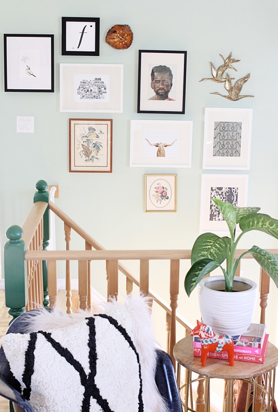
Start by deciding where you want your gallery wall! Try displaying your art on a wall no one would expect, such as your staircase!
2.
Pick out a few of your favorite pieces to display in your gallery. The mix of art really created a warm and inviting atmosphere as soon as your guests walk in through the front door. While making their way up the stairs, your company can peek into some of your favorite pieces you collected from your favorite shops, flea markets, and thrift stores!
3.
Trace your frames on newspaper, cut with scissors and tape to the wall.
4.
Play around with different arrangements and see what feels right to you. You’ll know when you see it!
5.
When you have the arrangement you love, you can start hanging your art by replacing the newspaper on the wall with your picture! It’s that simple! Just make sure to pre-measure where your print will hang before making any holes in your wall.
Once you have all my prints up but still feel that something is missing! Add this gorgeous print to the mix to really bring it all together!
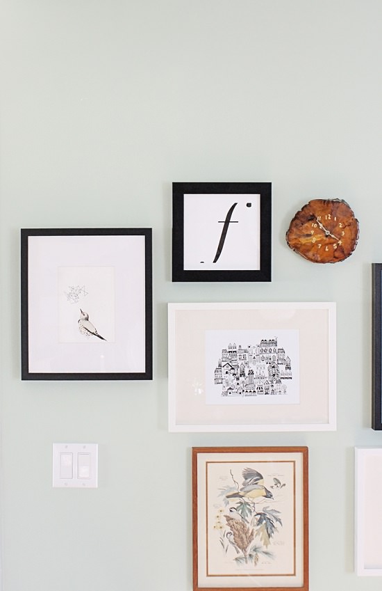
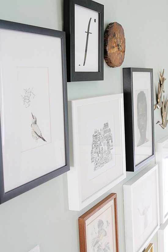
The Northern Flicker seemed to pull the other two bird prints together, so the eye can more easily move from left to right. The geometric pop also made the gallery wall have that balance between new and old! Moral of the story: don’t be afraid to change out or even add prints if you feel it’s just a little off! It will all be worth it in the end!
The staircase now has so much more personality, and you’ll be glad that the gallery wall really makes it pop! What do you think?


